


Mr. Beau's Essentials
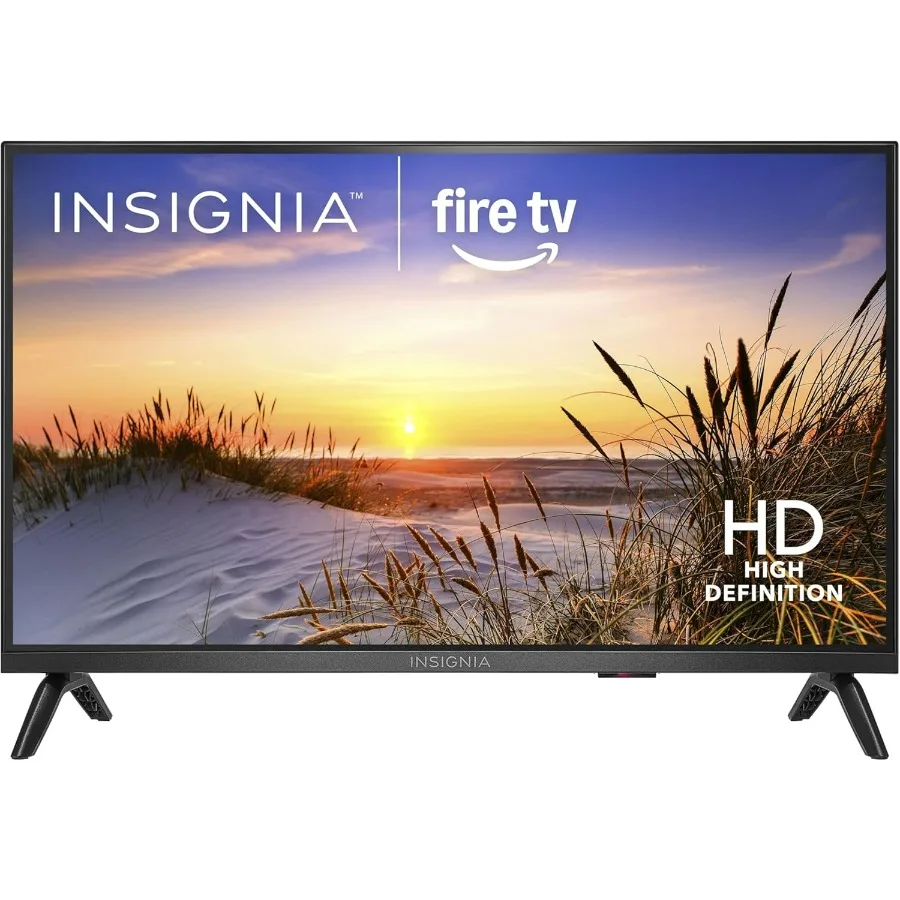
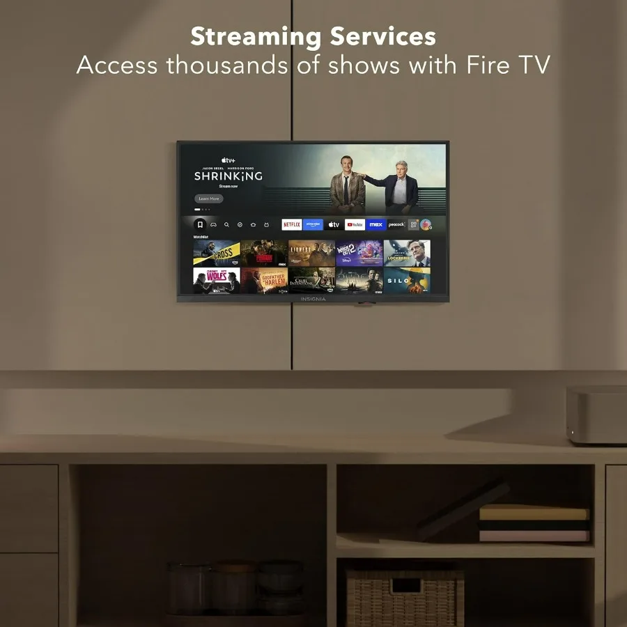
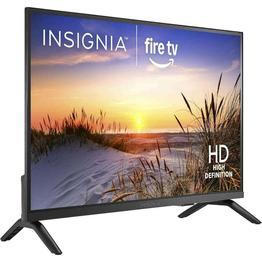
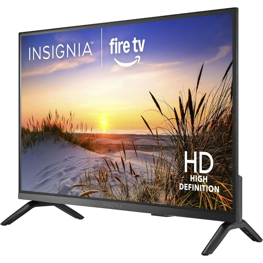
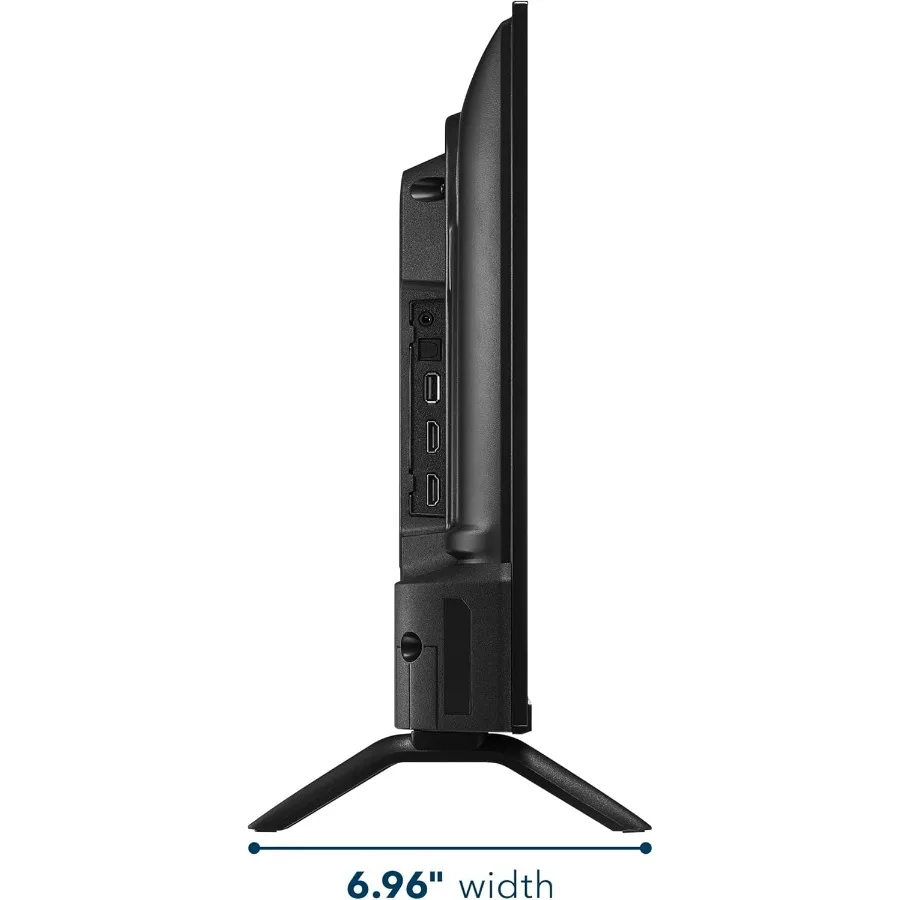
INSIGNIA 24” Class F20 Series LED HD Smart Fire TV with Alexa Voice Remote (NS-24F201NA26)
INSIGNIA 24” Class F20 Series LED HD Smart Fire TV with Alexa Voice Remote (NS-24F201NA26)
Regular price
$126.32 USD
Regular price
$0.00 USD
Sale price
$126.32 USD
Shipping calculated at checkout.
Quantity
Couldn't load pickup availability
SPECIFICATIONS
720p resolution: View your favorite movies, shows and games in full high definition.
Appearance: Modern Style
Brand Name: NONE
Frame Material: Plastic
General Use: Home Furniture
High-concerned chemical: None
Origin: US(Origin)
Specific Use: TV Stand
Type: Living Room Furniture
Product Description
.aplus-v2 .container-with-background-image {
width: 100%;
height: 100%;
background-repeat: no-repeat;
background-size: cover;
}
width: 100%;
height: 100%;
background-repeat: no-repeat;
background-size: cover;
}


.aplus-v2 .container-with-background-image {
width: 100%;
height: 100%;
background-repeat: no-repeat;
background-size: cover;
}
width: 100%;
height: 100%;
background-repeat: no-repeat;
background-size: cover;
}
.aplus-v2 .apm-brand-story-carousel-container {
position: relative;
}
.aplus-v2 .apm-brand-story-carousel-hero-container,
.aplus-v2 .apm-brand-story-carousel-hero-container > div {
position: absolute;
width: 100%;
}/*
Ensuring the carousel takes only the space it needs.
The sizes need to be set again on the absolutely positioned elements so they can take up space.
*/
.aplus-v2 .apm-brand-story-carousel-container,
.aplus-v2 .apm-brand-story-carousel-hero-container {
height: 625px;
width: 100%;
max-width: 1464px;
margin-left: auto;
margin-right: auto;
overflow: hidden;
}
.aplus-v2 .apm-brand-story-carousel-hero-container,
.aplus-v2 .apm-brand-story-carousel-hero-container > div {
height: 625px;
}.aplus-v2 .apm-brand-story-carousel.a-carousel-container {
padding: 0px;
}
/*
This centers the carousel vertically on top of the hero image container and after the logo area (125px).
Margin-top = (heroHeight - cardHeight - logoAreaHeight) / 2 + logoAreaHeight
*/
.aplus-v2 .apm-brand-story-carousel .a-carousel-row-inner {
margin-top: 149px;
}
/*
Cards need to have a width set, otherwise they default to 50px or so.
All cards must have the same width. The carousel will resize itself so all cards take the width of the largest card.
The left margin is for leaving a space between each card.
*/
.aplus-v2 .apm-brand-story-carousel .a-carousel-card {
width: 362px;
margin-left: 30px !important;
}
/* styling the navigation buttons so they are taller, flush with the sides, and have a clean white background */
.aplus-v2 .apm-brand-story-carousel .a-carousel-col.a-carousel-left,
.aplus-v2 .apm-brand-story-carousel .a-carousel-col.a-carousel-right {
padding: 0px;
}
.aplus-v2 .apm-brand-story-carousel .a-carousel-col.a-carousel-left .a-button-image,
.aplus-v2 .apm-brand-story-carousel .a-carousel-col.a-carousel-right .a-button-image {
border: none;
margin: 0px;
}
.aplus-v2 .apm-brand-story-carousel .a-carousel-col.a-carousel-left .a-button-image .a-button-inner,
.aplus-v2 .apm-brand-story-carousel .a-carousel-col.a-carousel-right .a-button-image .a-button-inner {
background: #fff;
padding: 20px 6px;
}
.aplus-v2 .apm-brand-story-carousel .a-carousel-col.a-carousel-left .a-button-image .a-button-inner {
border-radius: 0px 4px 4px 0px;
}
.aplus-v2 .apm-brand-story-carousel .a-carousel-col.a-carousel-right .a-button-image .a-button-inner {
border-radius: 4px 0px 0px 4px;
}


.aplus-v2 .aplus-review-right-padding {
padding-right: 0.1rem;
}.aplus-v2 .aplus-review-right-padding {
padding-right: 0.1rem;
}.aplus-v2 .aplus-review-right-padding {
padding-right: 0.1rem;
}.aplus-v2 .aplus-review-right-padding {
padding-right: 0.1rem;
}.aplus-v2 .aplus-review-right-padding {
padding-right: 0.1rem;
}
padding-right: 0.1rem;
}.aplus-v2 .aplus-review-right-padding {
padding-right: 0.1rem;
}.aplus-v2 .aplus-review-right-padding {
padding-right: 0.1rem;
}.aplus-v2 .aplus-review-right-padding {
padding-right: 0.1rem;
}.aplus-v2 .aplus-review-right-padding {
padding-right: 0.1rem;
}


